
Intro to Color Theory (or colour if you're British and need to tell everyone)
I'm going to take an educated guess and say the first thing you noticed on pixelbakery.com was the color of the website. Whether the color was digested and thought about or subconsciously acknowledged, there was absolutely no way to avoid it.
Color influences so much more than people tend to realize. It plays a huge part in what we buy, what we wear, and what we feel. The list can go on and on.
WHAT IS COLOR?
Color, in its most basic form, is light. That light travels in waves and passes through a medium (like air or water, duh) or bounces off of something before reaching the cones (like the construction ones) within the human eye. This is similar to how sound travels to the ear, though, light travels at an exponentially greater speed than sound.
Light emitted from the sun and other sources is a combination of all colors on the visible spectrum (remember ROYGBV from elementary school?). We see this combo of light as the color white (COOL, RIGHT?).
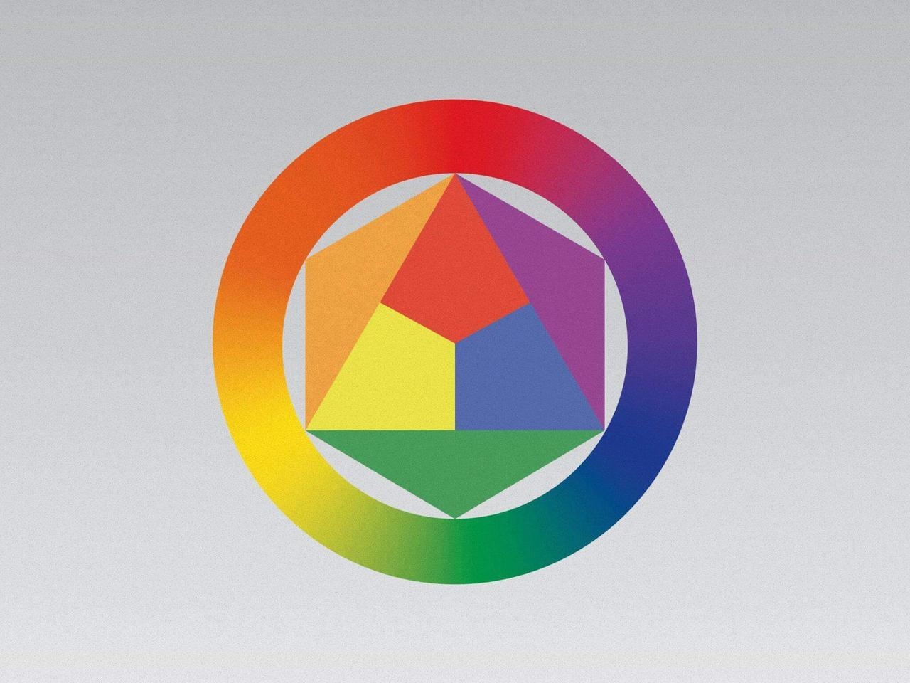
Speaking of elementary school, most of us learned that there are 3 sets of colors in the basic wheel. Primary, Secondary, and Tertiary. These classifications act as the "steps" between each color. The colors included in each are as follows:
Primary: red, yellow, blue
Secondary: orange, green, violet
Tertiary: red-orange, blue-green, red-violet, etc.
 omg pretty
SO, HOW DOES COLOR IMPACT DESIGN?
Today, we've learned that the color wheel contains basically every color on the visible spectrum that we as humans can see.
SIDENOTE: On either end of the spectrum we have ultraviolet light (sunburns... ouch) and infrared light (night vision... oooo).
What do visible colors mean to a designer or artist, though?
Over the course of time, the meanings of colors within branding and marketing have changed, so I will give you a hitchhiker's guide as to what they currently mean.
Red:
pros: strength, excitement, youth, and boldness
cons: aggressiveness, strain, and demand
Orange:
pros: friendliness, cheerfulness, confidence
cons: frustrating, immaturity
Yellow:
pros: optimism, creativity, self-esteem
cons: anxiety, irrationality, fear
Green:
pros: balance, harmony, peace
cons: boredom, stagnation
Blue:
pros: intelligence, trust, calmness
cons: coldness, sadness, lack of emotion
Violet:
pros: spirituality, luxury, royalty
cons: introversion, suppression
and finally...
Pink:
pros: tranquility, love, millennials
cons: physical weakness, inhibition, millennials
The next time you look at a poster in the movie theater or get a notification from Facebook, see if you can find any of these meanings at play. They are in nearly everything you see and are more prevalent in our digital society now than ever before.